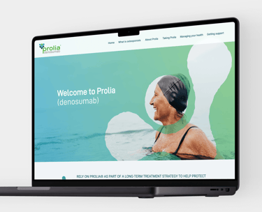
Created in partnership with Amgen, Prolia is a vital treatment for patients suffering from osteoporosis. This medication empowers individuals to address their bone health, enhance understanding of their condition, and effectively manage their treatment regimens. Prolia's innovative approach supports patients in maintaining their well-being and reduces the risk of fractures.
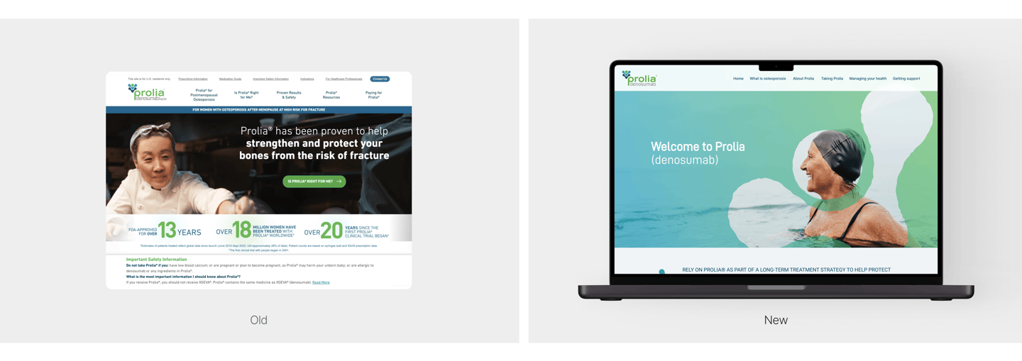
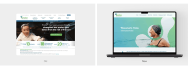
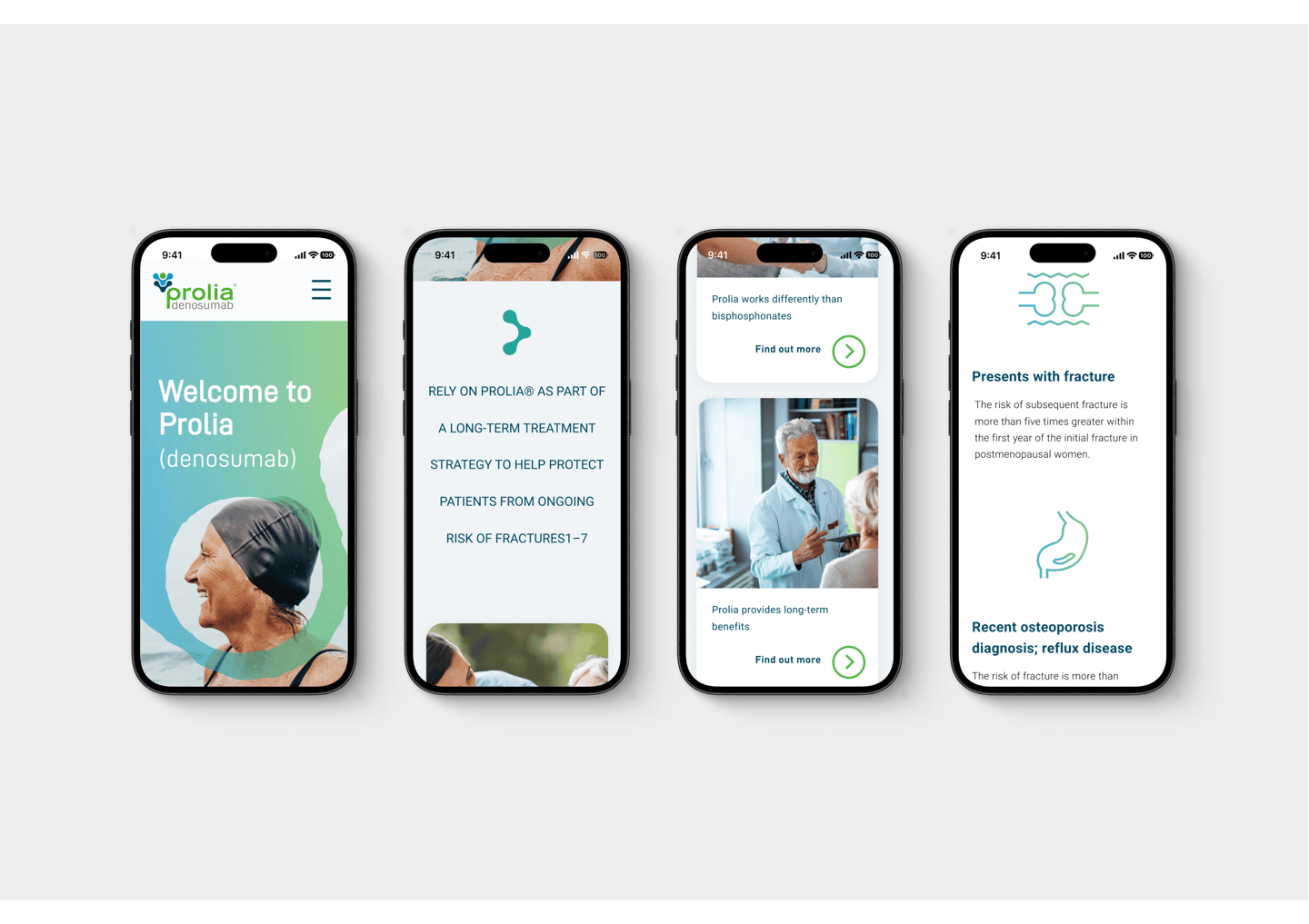
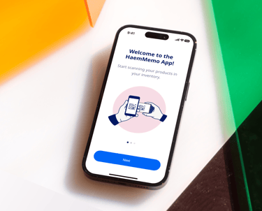
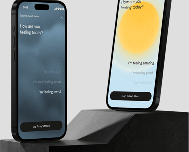
The challenge of rebranding and reskinning the UI and brand of Prolia lies in transforming the user experience (UX) to enhance engagement while modernizing the presentation of medical products. This involves creating a visually appealing and intuitive interface that resonates with both healthcare professionals and patients, ensuring the brand narrative is clear and recognizable. By leveraging contemporary design principles and digital marketing strategies, the goal is to shift the perception of Prolia from a standard pharmaceutical product to a dynamic health solution. This modernization will not only improve user interaction but will also foster trust and loyalty, ultimately positioning Prolia as a leader in its category within the e-commerce landscape.
Challenge
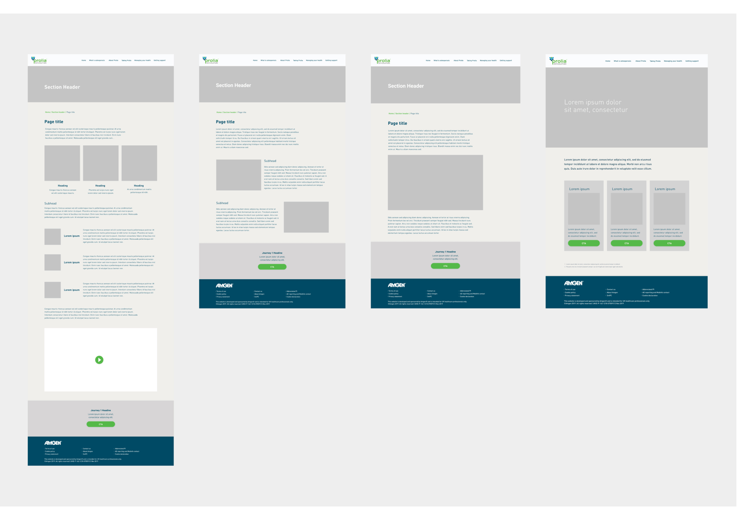
To overcome the challenge of rebranding Prolia, we adopted an approach centered around exploring conceptual art directions that maintain a strong connection to the brand's core values. This strategy focused on creating a visual identity that resonates with consumers, fostering a sense of familiarity and empathy with the Prolia brand. By emphasizing relatable and compelling design elements, we aimed to enhance brand engagement and encourage a deeper B2C connection. This approach not only modernizes the perception of Prolia but also cultivates an environment where consumers feel confident in interacting with a brand they recognize and trust.
Approach
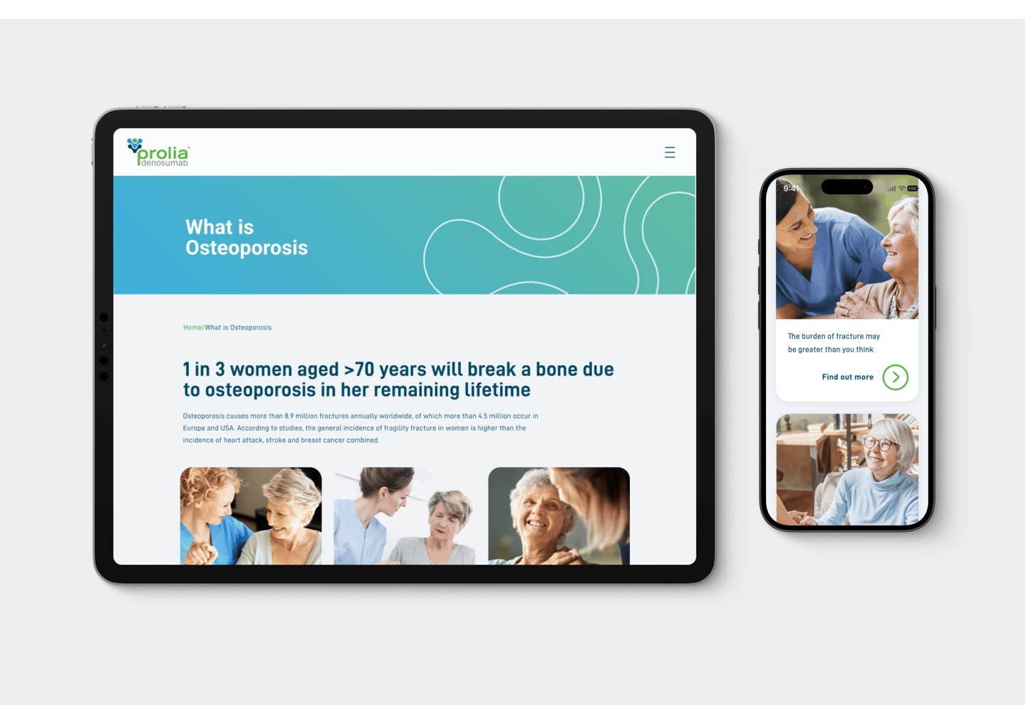
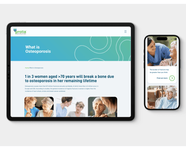
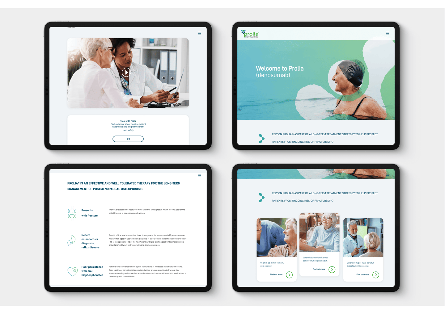
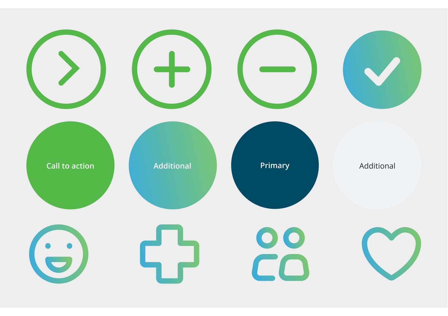
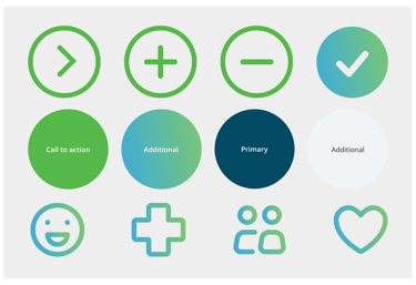
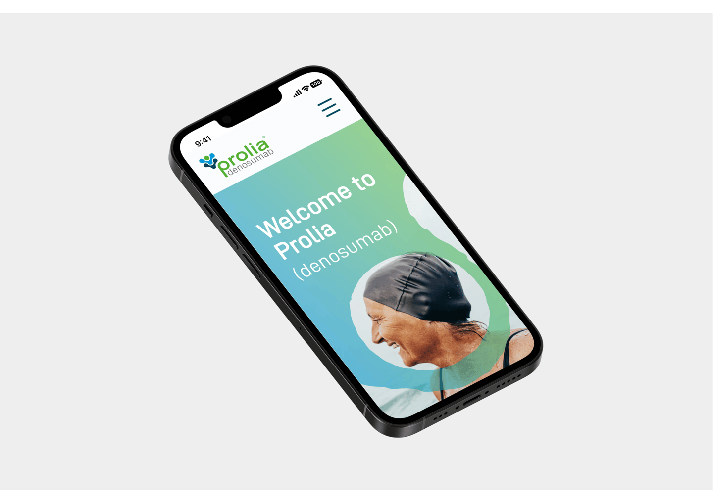
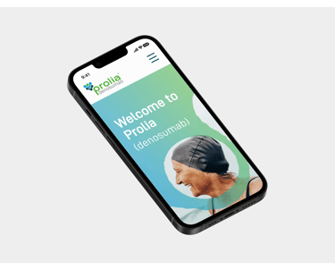
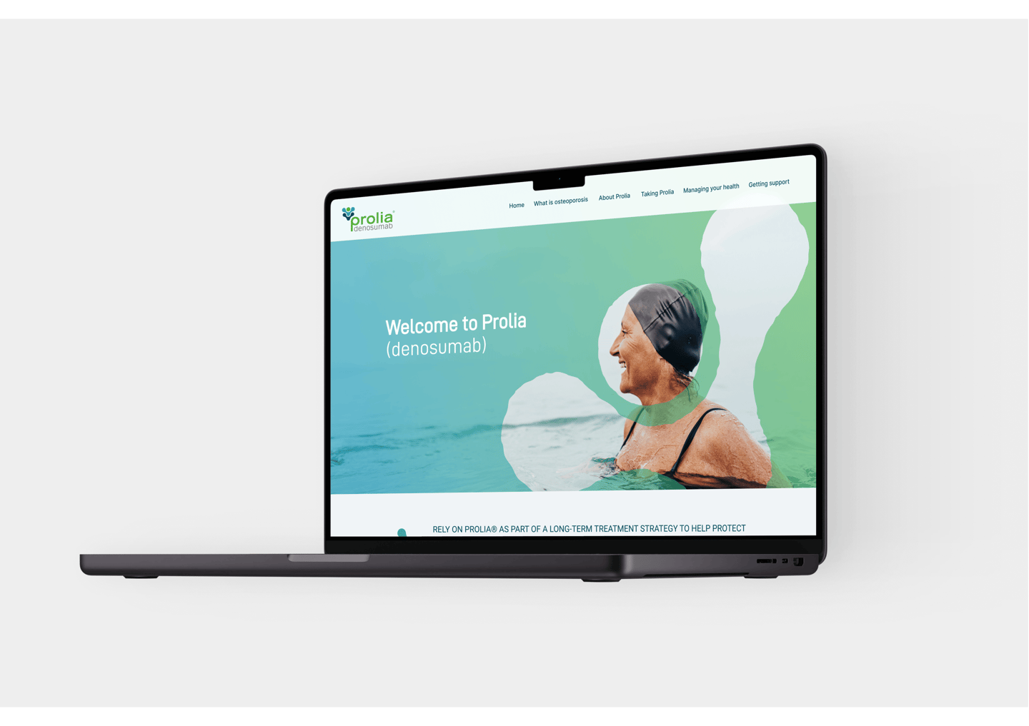
To address the rebranding challenge, we executed a fresh reskin of Prolia that reconnected with the brand's core driver: providing freedom and a new lease on life for patients. This overarching ideology was intricately woven into the brand’s new visual identity, particularly through a carefully curated color palette that features natural tones. These colors symbolize the positive possibilities that come with taking the medication, effectively reflecting the doors it opens for patients. By reinforcing this connection between the brand’s mission and its aesthetic, we aimed to foster deeper engagement with consumers, ultimately enabling them to see Prolia not just as a product, but as a pathway to improved well-being and enhanced quality of life.
Solution