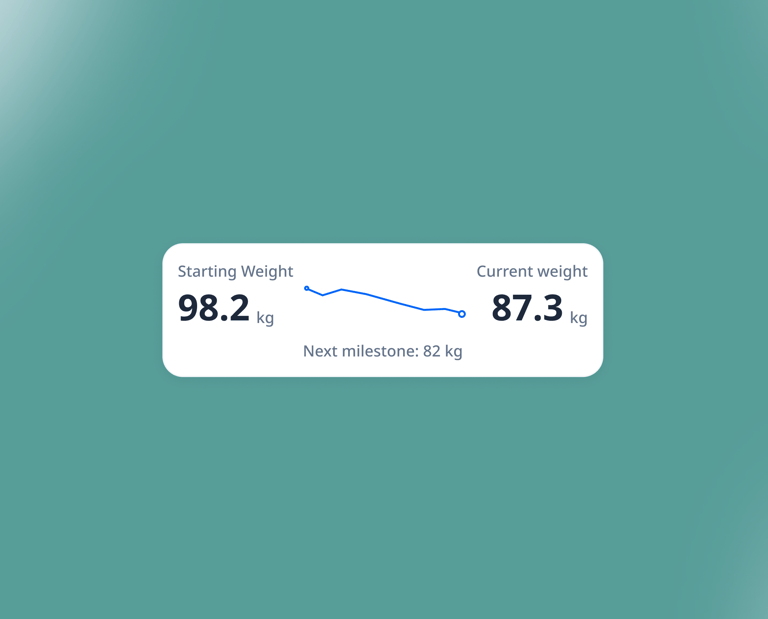
Redefining the obesity care landscape in APAC by providing smarter tools for better outcomes.
Novo Nordisk
Lead Product Designer
Jun 2022 - Aug 2022
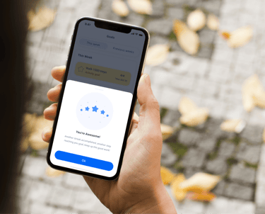
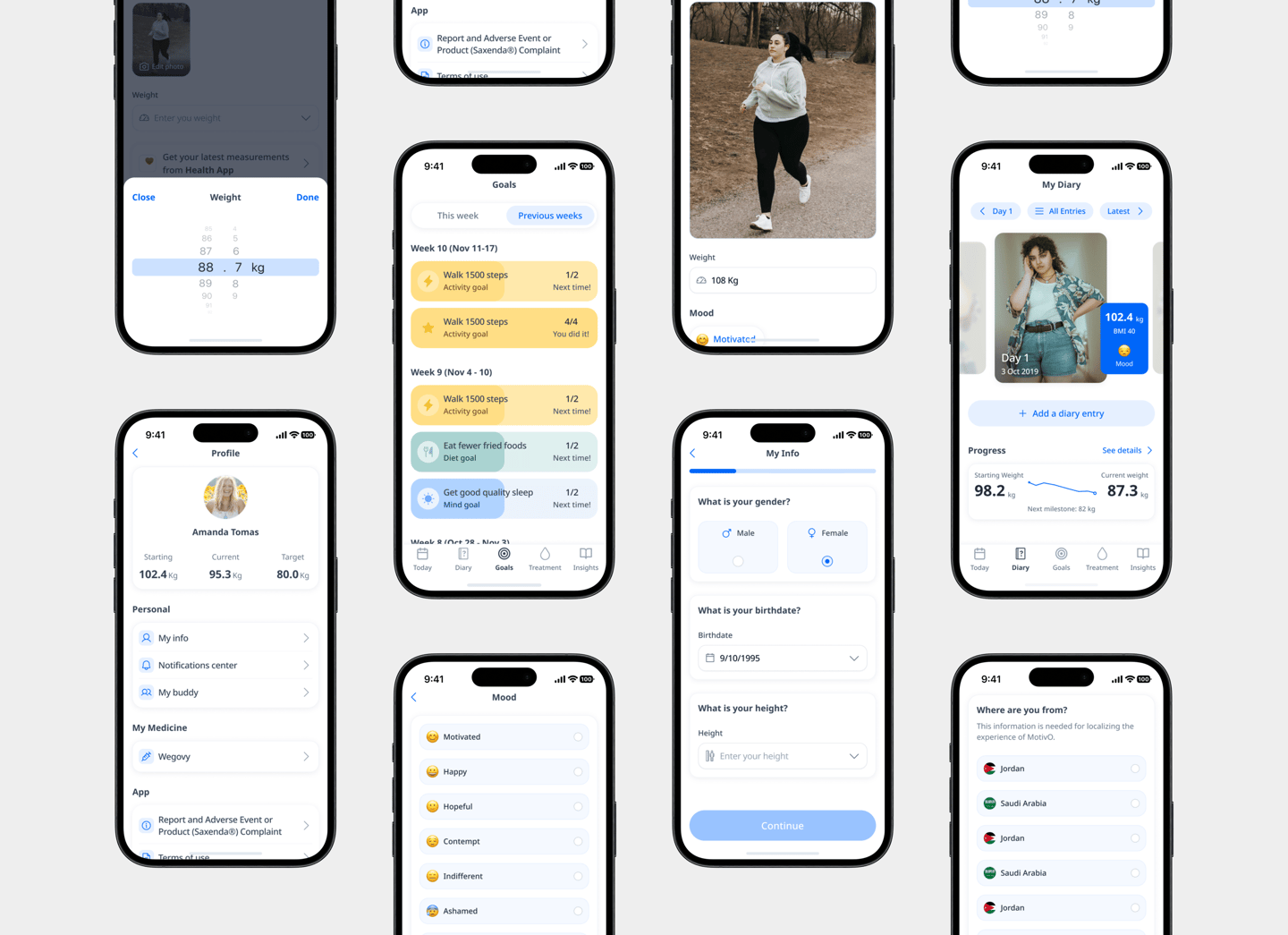
Transitioning to self-management is the hardest part of obesity care. MotivO turns daily challenges into actionable data, empowering patients to stay on track and providing clinicians with the clarity to tailor every treatment plan.
Built with Novo Nordisk and a global network of experts, MotivO was shaped by real patient stories. We listened closely to the physical and emotional challenges of obesity to create a tool that truly supports the journey.
MotivO isn’t just another app on your home screen; it’s a dynamic toolkit designed for lasting, sustainable change. By bridging the gap between daily patient life and clinical oversight, MotivO empowers you to take the driver's seat in your recovery and wellness.
Nine core pillars to ensure your journey is supported from every angle:
Personalised Guidance: Utilize Personalised Reminders & Feedback alongside Treatment plans that adapt to your specific needs.
Daily Tracking: Keep a clear record with the Diary and Data Capture tools, making symptom tracking effortless.
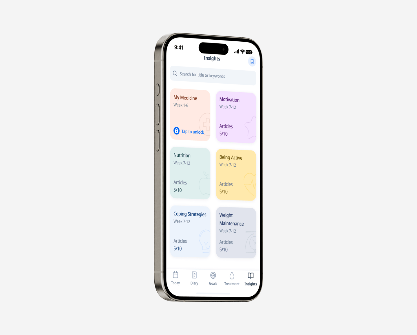
Actionable Data: Turn your daily entries into Insights and Progress reports that help both you and your clinician understand your trajectory.
Holistic Support: Navigate your path with the Journey feature and stay connected through the Buddy Feature, ensuring you never feel alone.
Clinical Flexibility: A Home Page & Treatment Agnostic approach means the app works with your existing medical framework, not against it.


86%
Within three months of launch, the new panel showed clear results.
Completion rate for the newly designed clinician setup wizard.
-14 mins
Average time saved per clinician per week due to the new shareable health report format.
4.8/5
Average user satisfaction rating for the emotional resilience content library.
15%
Standardised health data sharing protocols, increasing patient provider data transparency.
Condensed pain points from interviews with stakeholders.
Patients feel that there is a lack of guidance
Patients felt there is a lack of personalised adjustment plans
Patients felt there is a lack of continual motivation
There was no place to track and record sustainable habits


Lack of resources when treating and managing people with obesity
Patients feel that there is also a lack of clinicians resources


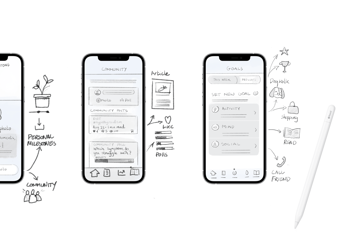

Work shop to help define commercial goals.
Generate Real-World Evidence.
Optimize Clinical Decision-Making (titration).
Maximise Treatment Persistence.


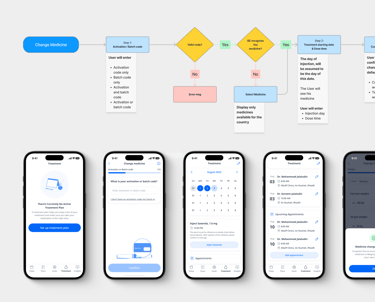
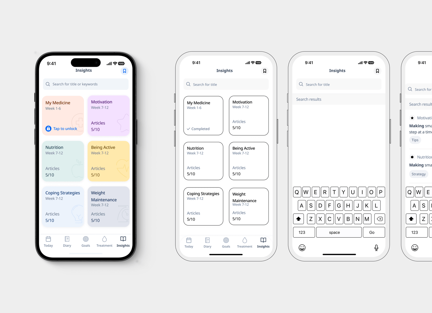

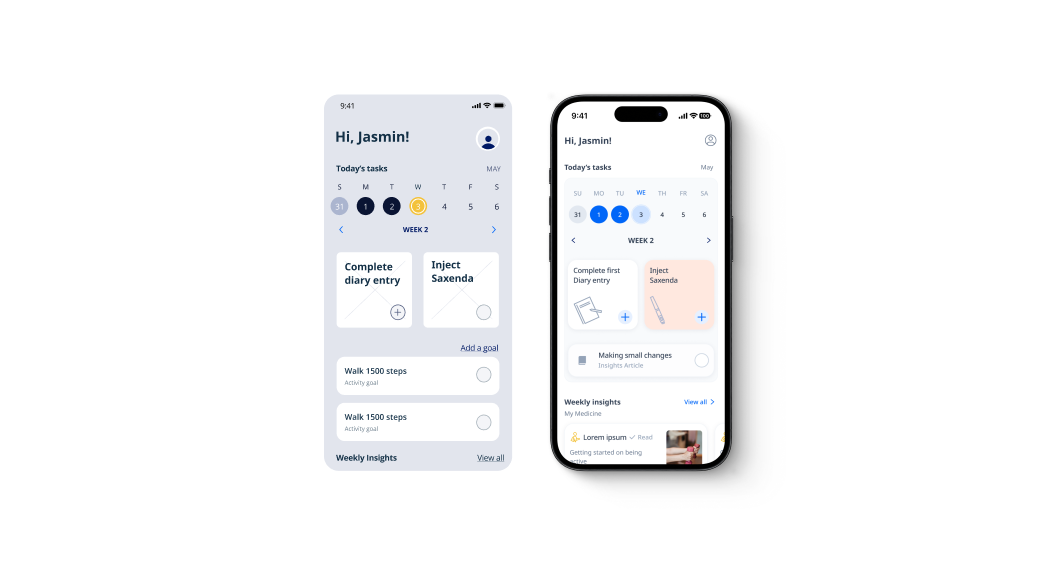
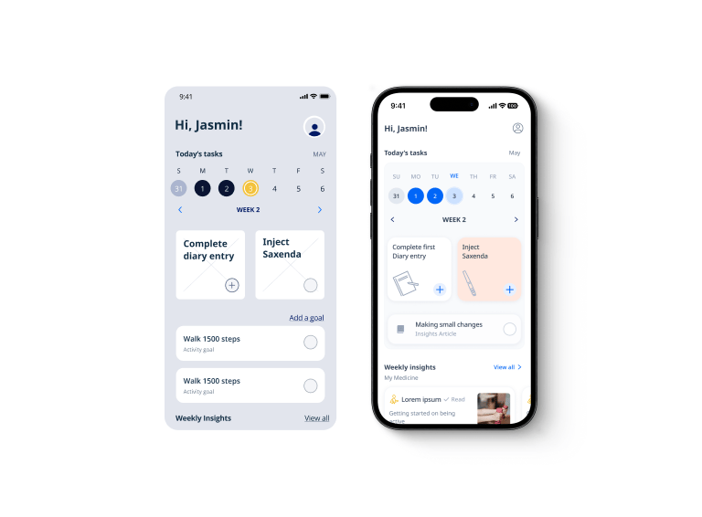
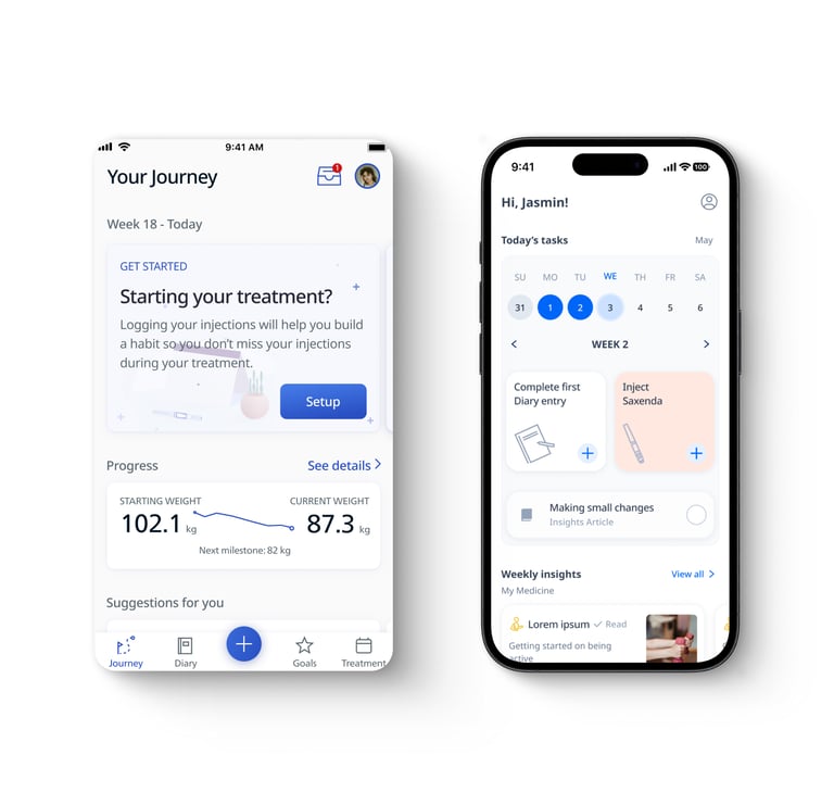
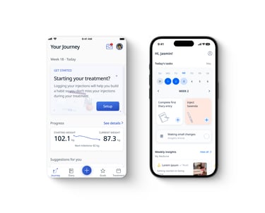
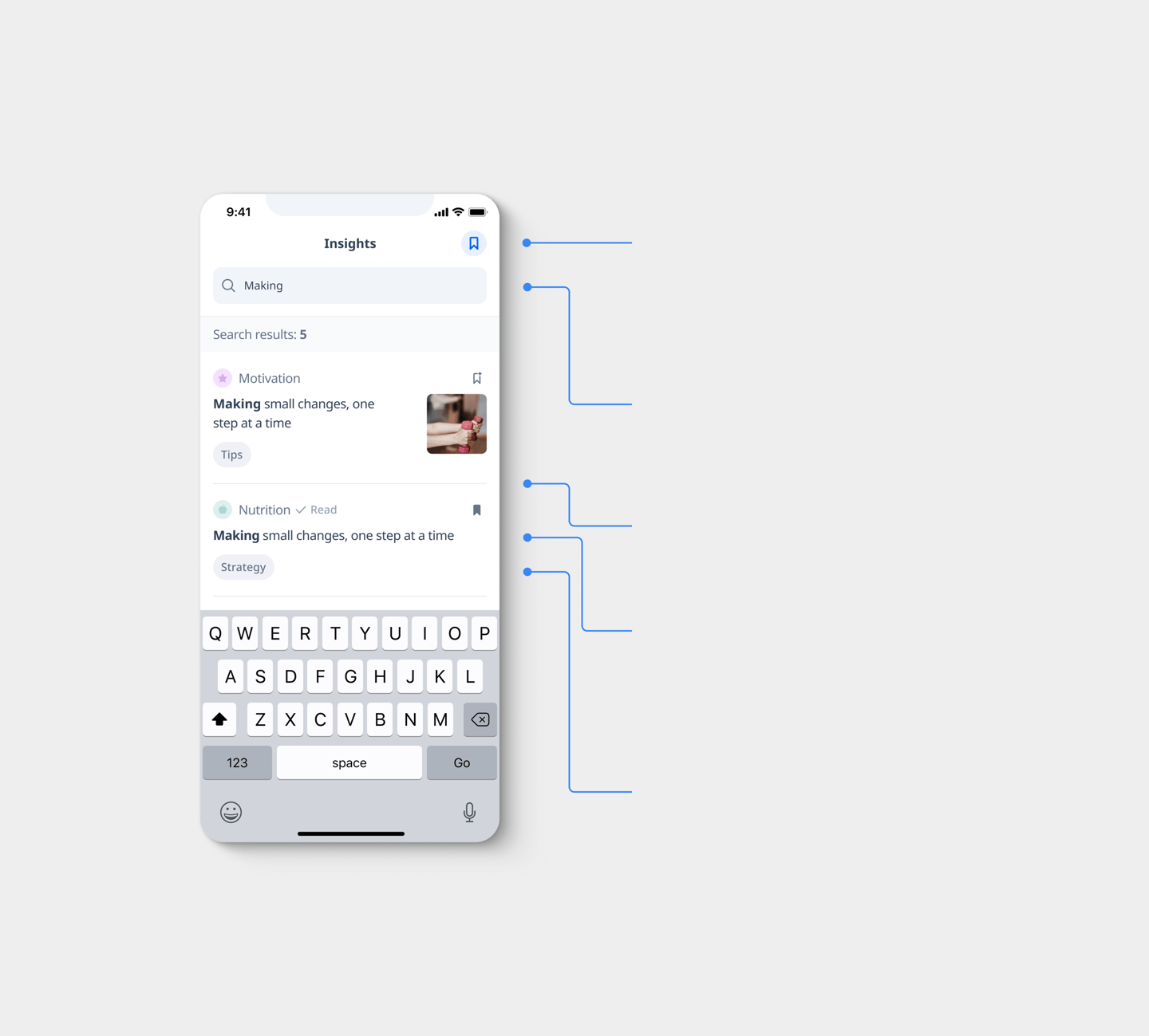
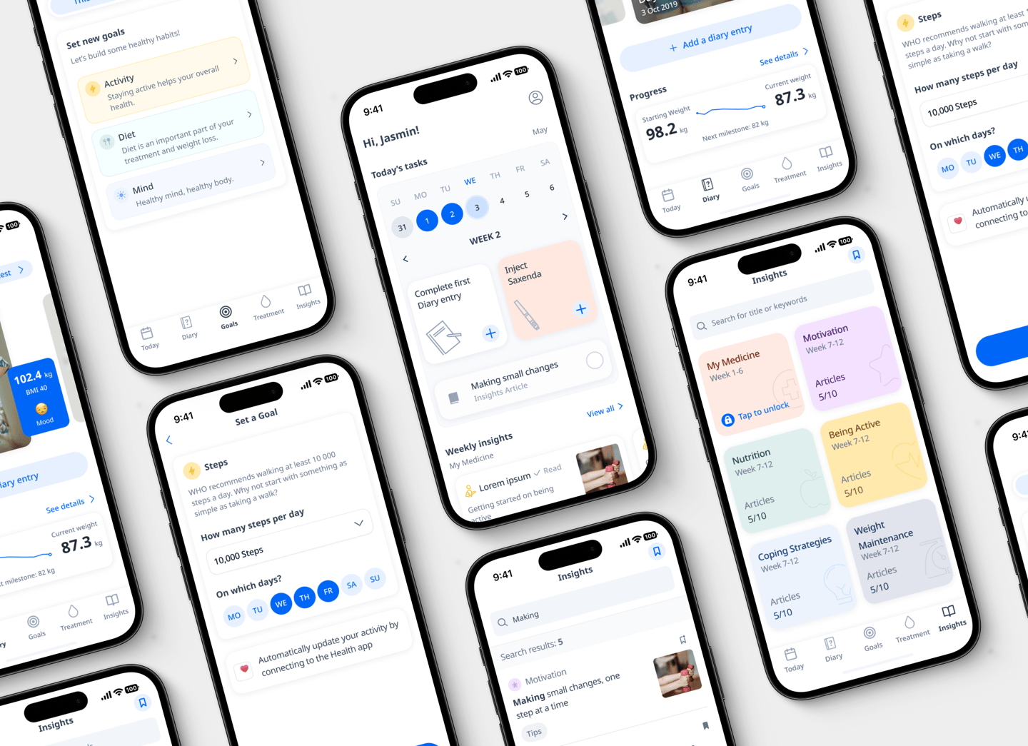
Bookmark - Save your favorites. Bookmark the articles that inspired you most for quick and easy access.
Search - Integrated keyword search streamlines content discovery, optimizing user flow and task efficiency.
Snippet description - High-level summaries used to spark user interest.
Tag - Each article features a descriptive tag to pre-inform users and guide content discovery.
Insight theme - Articles use color-coded icons to indicate themes.
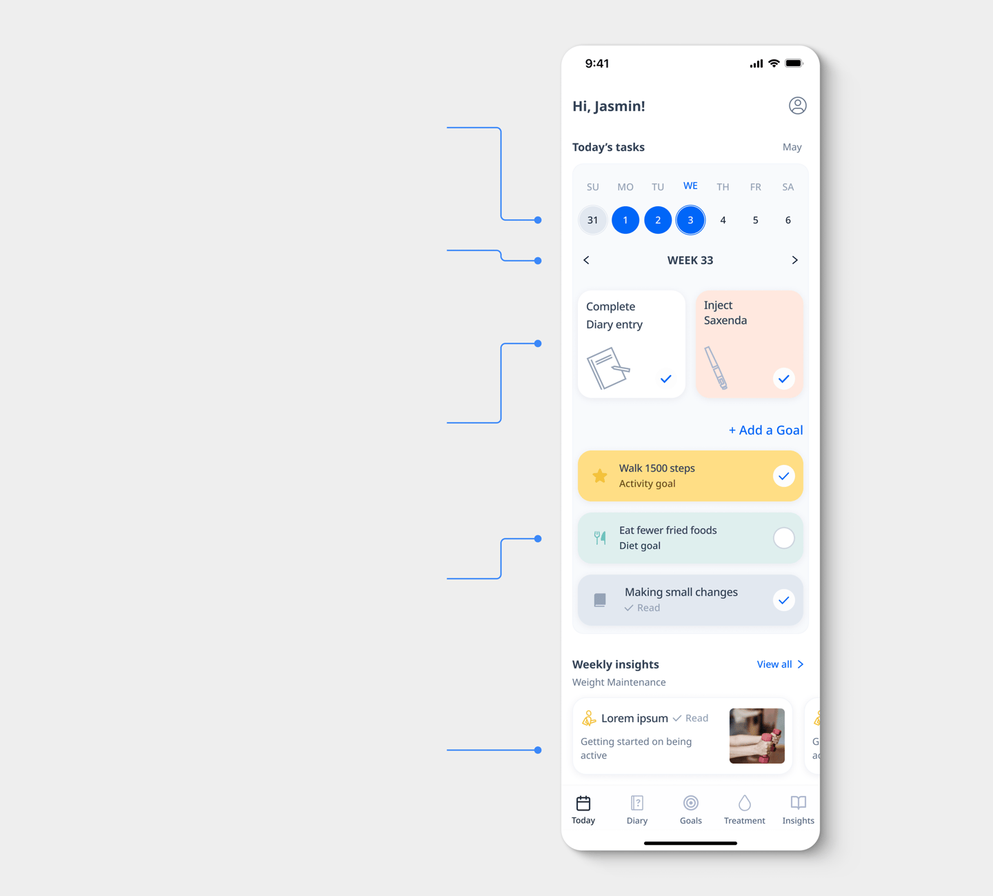
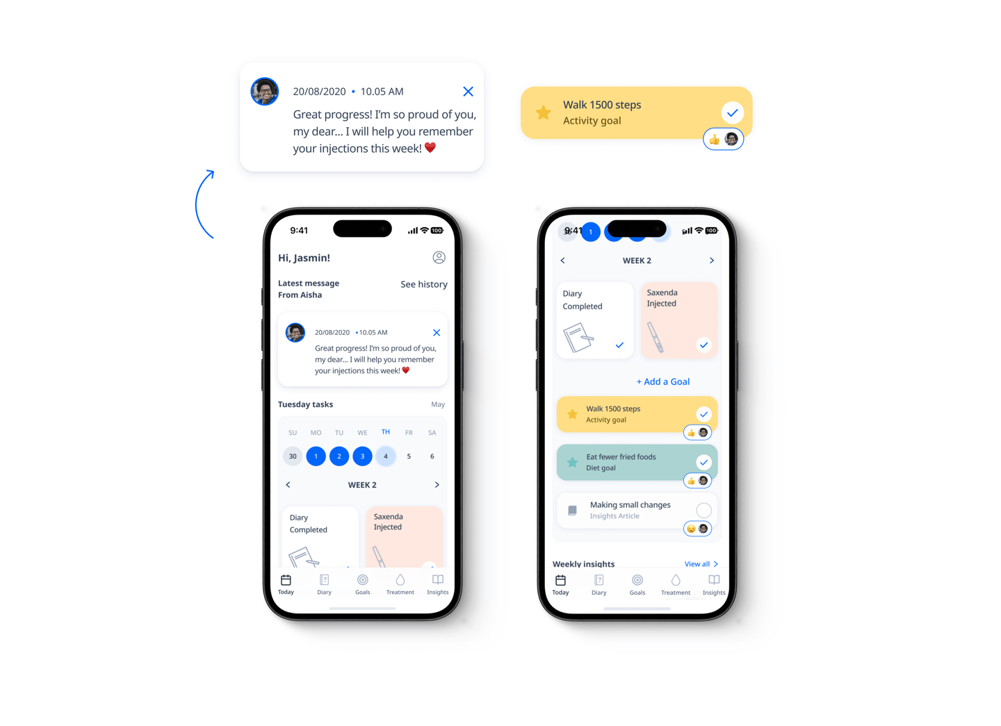
New calendar status indicator - Focus user attention on the current date, using "Incomplete" status indicators to drive habit-tracking completion.
New clickable calendar - Track your wins and set future milestones with our interactive calendar—designed to build confidence through visible progress.
Reading - Tailored weekly content to guide your treatment, boost your mood, and ensure you never feel alone in your journey.
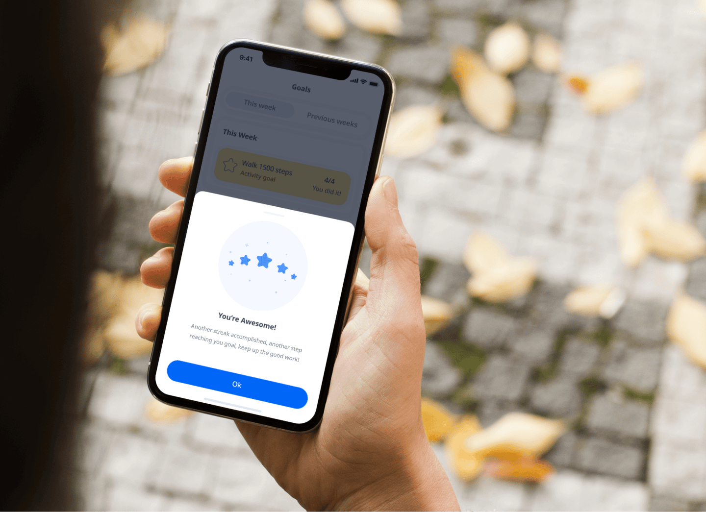
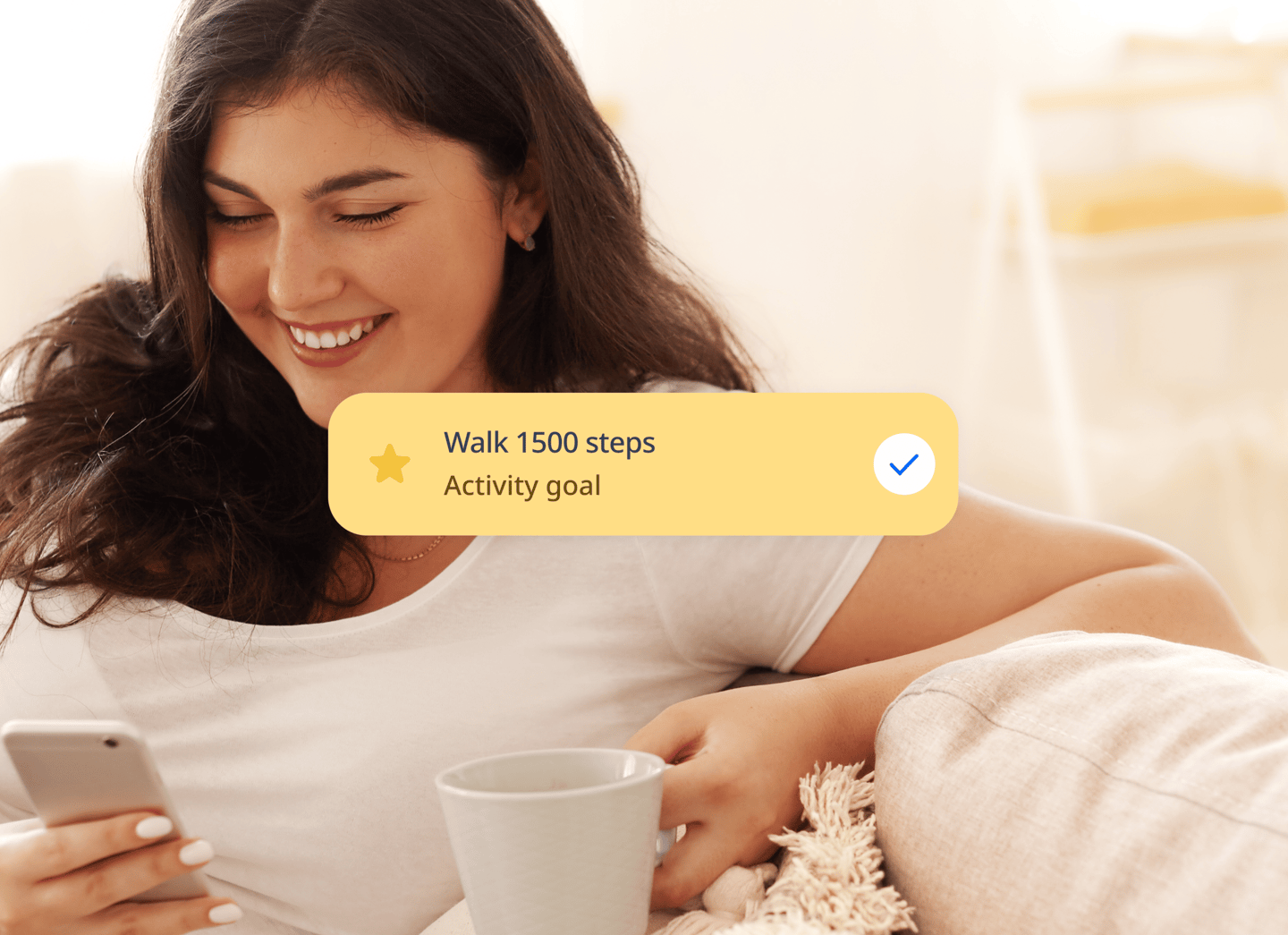
Goals - Track physical, mental, and personal diary goals in one place.
Diary & Medicine entry - Focus the user on medicine logging and diary entries first. Track mood and measurements as secondary metrics to monitor treatment impact.
Testimonial
"He has helped Dawn with a diverse set of challenges ranging from complex client projects to internal communication and has shown great flexibility in always stepping in and helping with any challenge, sometimes under challenging timelines and circumstances."
Soren Pedersen, VP of Product Strategy
