Tackling Obesity with MotivO

Tackling the topic of obesity, how can MotivO 2.0 re-generate engagement in an personalised way to raise expectation on how treat Obesity within the APAC region.

NOVO NORDISK

RESPONSIBILITIES

Creative Direction

Digital design system

UX/UI

iOS

Android

Strategy

Design Thinking

Motivo 2.0 is an mobile application that that is that was launched within the Asian Pacific region to help treat patients with diagnosed obesity. Through features in the app patients can instil habits to improved their health and wellbeing whilst take their daily medication.

INTRODUCTION

Leveraging expectations. Driving engagement.

From early 2021, a series of Interviews were conducted to HCPs and patients across the APAC region. The questions were directed to detect pain points from stakeholders who were diagnosed with Obesity and health care professionals who were treating the disease. The information that we received were in the form of user stories, this allowed us to understand pains along the user journey.

My role at this stage was to synthesise the data into key insights to help accommodate user needs across the APAC region whilst answer commercial needs.

The underlying factor was to generate habits within the user to drive activity whilst nurturing the patients to make progression but what would it take to build that engagement?

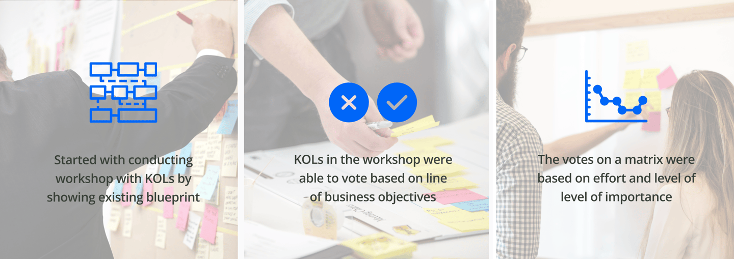
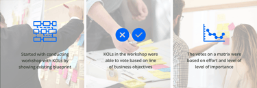
In order to do so, we needed to create a clear narrative to help the team understand how our product fits plays an integral part of the lives our users. To make sure we did that we ran a series of workshops with the team and the clients to help create an array of behavioural architypes, empathy maps and service blueprints.

80% of patients dropping out of treatment after 3 months

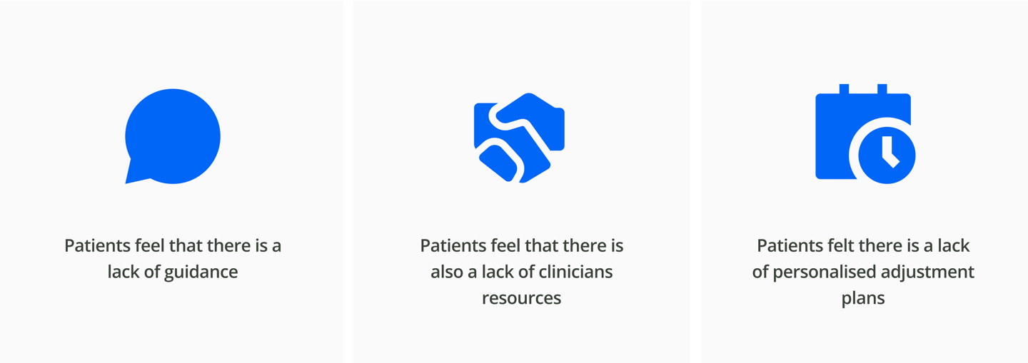
Patients feel that there is also a lack of clinicians resources

Patients felt there is a lack of personalised adjustment plans

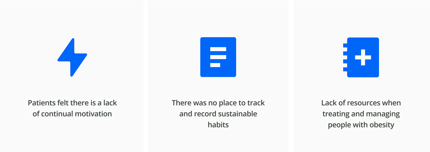
Patients felt there is a lack of continual motivation

Patients feel that there is a lack of guidance

There was no place to track and record sustainable habits

Lack of resources when treating and managing people with obesity

Understanding our users fast and interate.

Based on UX principles we were were able to generate clear hypothesis based on several assumptions and then analysing the prioritised insights were able to formulate 'How might We?' questions.

We ran a workshop with the clients to present pain points that crossed over from market to market which we felt that should be prioritised. We also presented commercial success goals that should be prioritised. These were presented in handmade sketches.

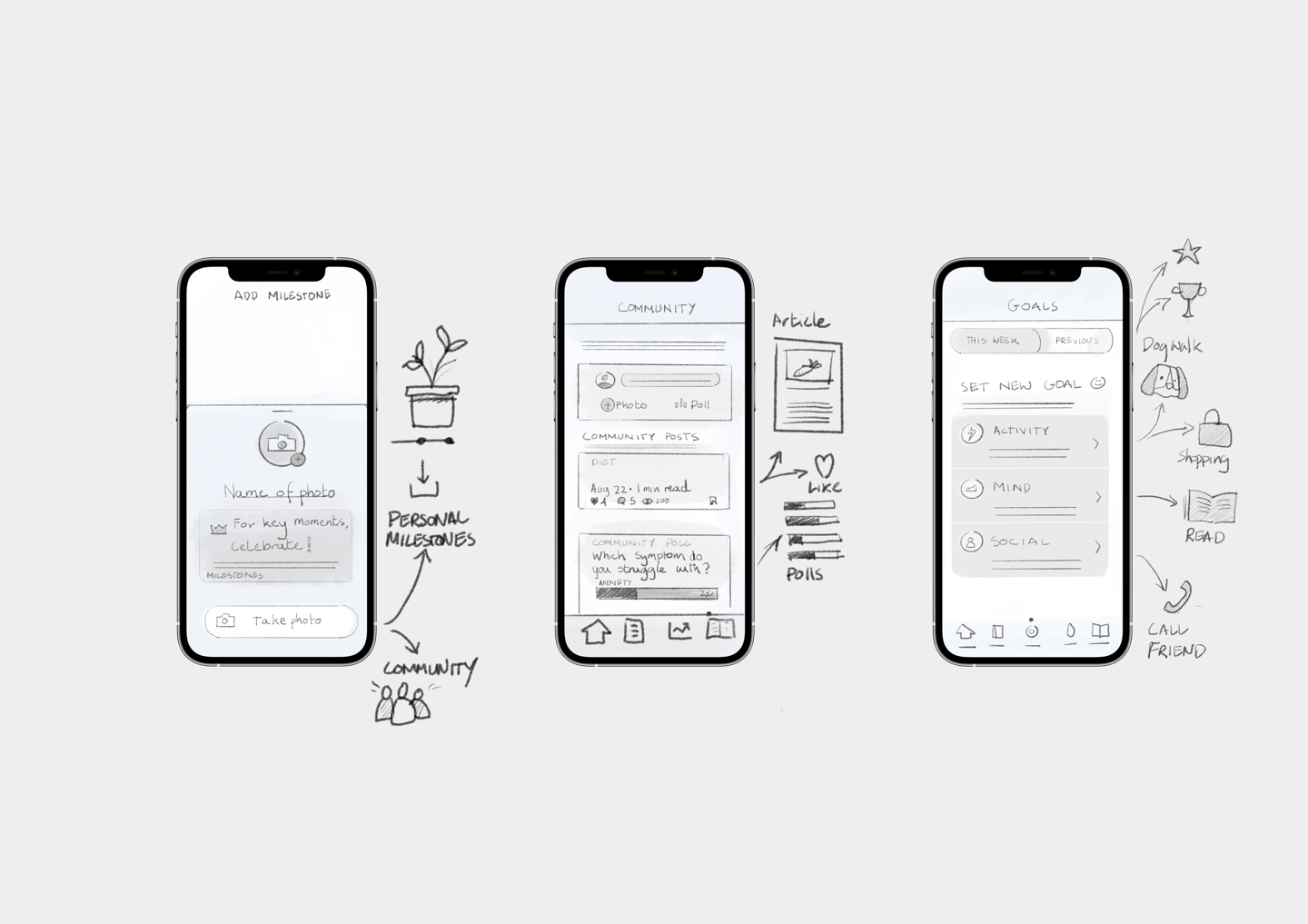
Formulating user flows and wireframes

Before starting the project starting a series of tests were conducted on HCPs in Iran, Joran, Saudi Arabia and UAE. It was noticed that people diagnosed with obesity are generally not achieving their treatment goals with up to 80% dropping out of treatment after three months.

This is a complex problem that stems from both the patient’s lack of guidance and the clinician’s lack of resources. Patients miss personalised adjustment plans, continual motivation, and a place to track and

record sustainable habits while clinicians lack the resources demanded of them when treating and managing people with obesity.

Wireframe designs were conducted to represent a low fidelity of the user flows. This helped us save time to help make sure that crucial step were taken into consideration before spending time on higher fidelity designs.

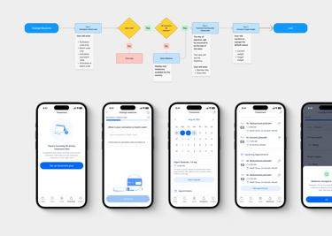
Information flows

The invention of MotivO was primarily because Novo Nordisk released their new drug to treat Obesity. Creating information architecture helped the process by easily indicating how users can switch from Saxenda to Wegovy.

MotivO 1.0

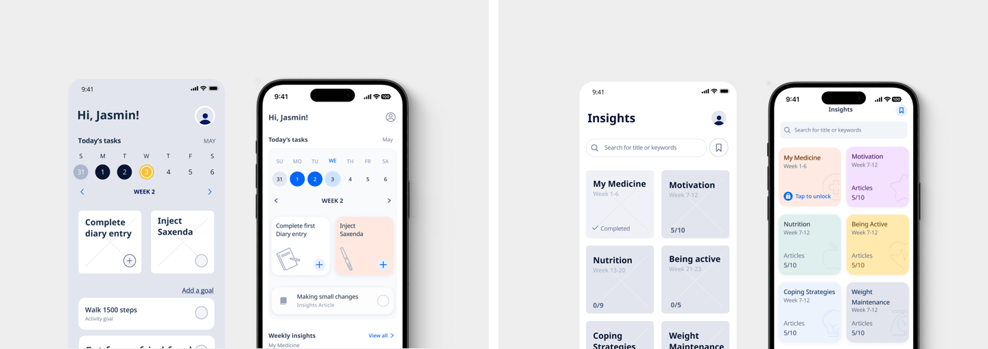
The MotivO 1.0 had an unpersonalised look and feel. It was obvious to me that the grey background and the dark blue felt quite masculine. The visualisation of the interface looked very clinical. The clinical look can reduce the personalised connection with the app, which ultimately can reduce engagement with the app which could affect the users adherence to taking their daily medicine.

We wanted to add warm appealing colours to the design to interject a friendly tone of voice and a environment that was welcoming, trustworthy and motivating. ​​​​​​​

UI Components

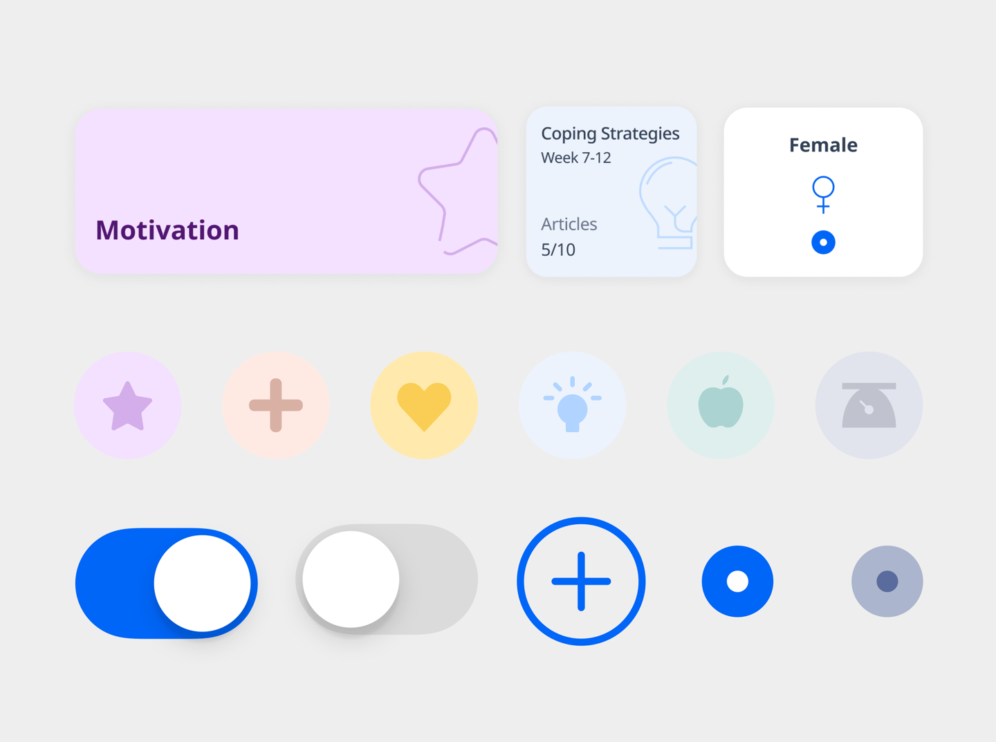
A component library was carefully constructed to ensuring consistency across the MotivO product. Here is a collection of some of the components built and utilised .

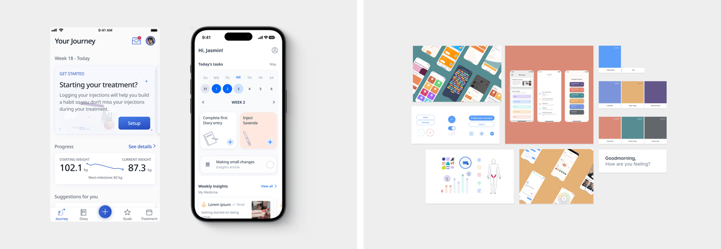
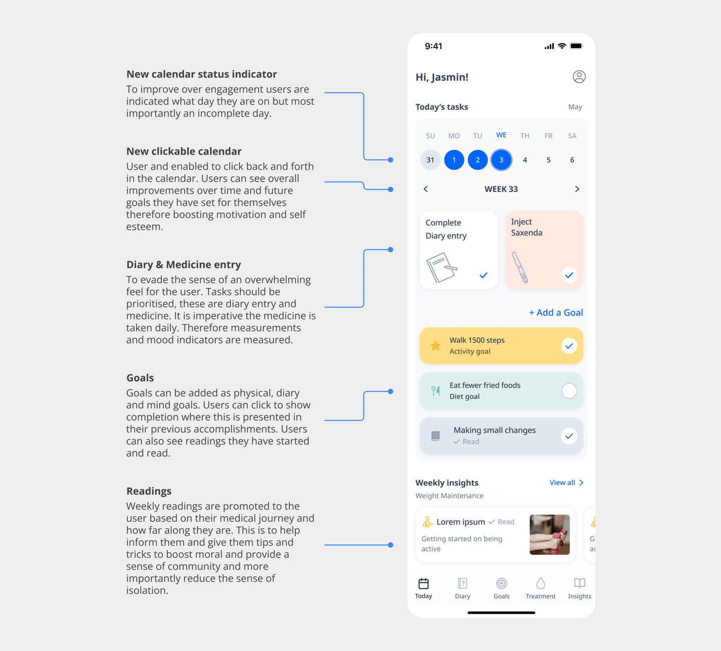
New calendar status indicator

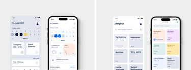
The home page was crafted to help generate motivation, manage their treating and have a personalised overview of their progression

To improve over engagement users are
indicated what day they are on but most importantly an incomplete day.

New clickable calendar

User and enabled to click back and forth in the calendar. Users can see overall improvements over time and future goals they have set for themselves therefore boosting motivation and self esteem.

Diary & Medicine entry

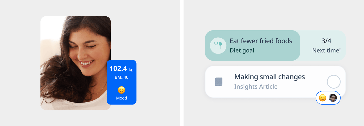
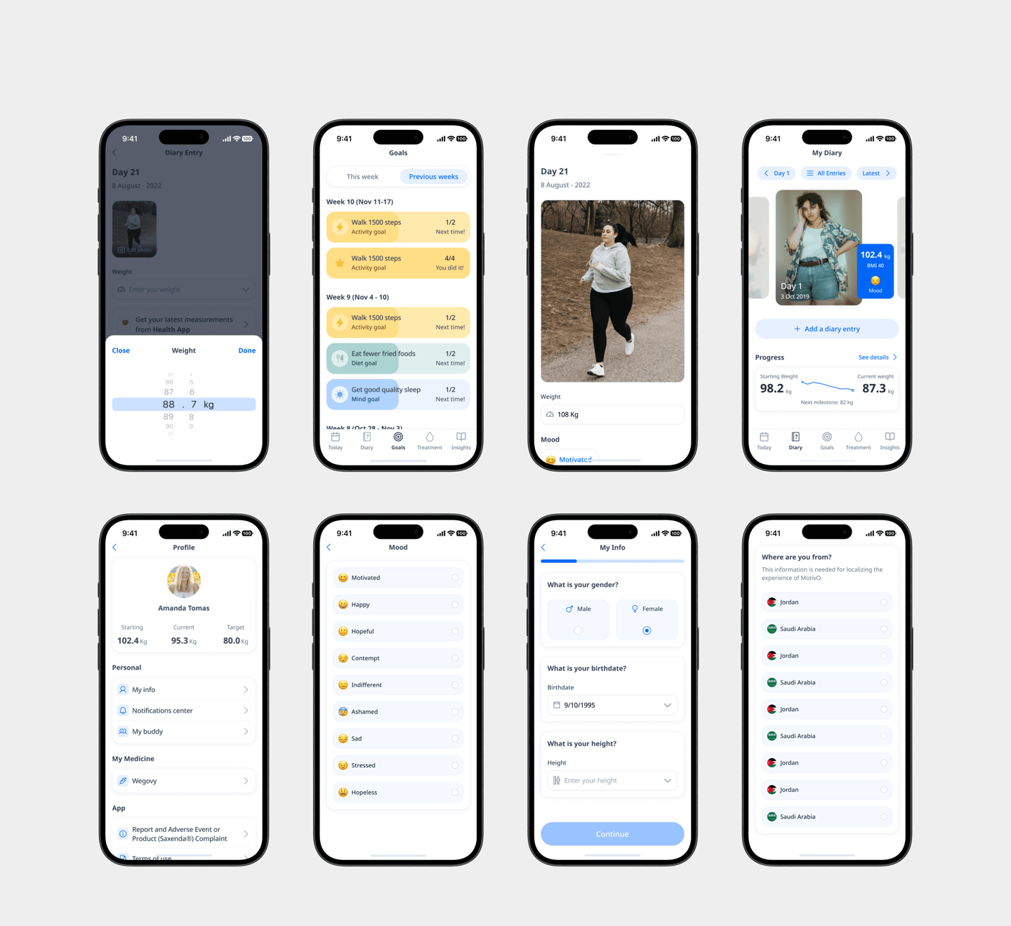
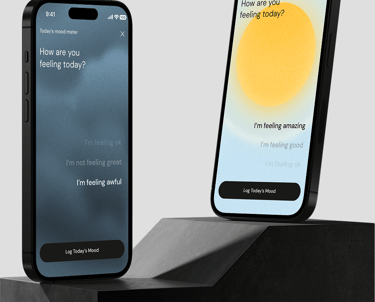
To evade the sense of an overwhelming feel for the user. Tasks should be prioritised, these are diary entry and medicine. It is imperative the medicine is taken daily. Therefore measurements and mood indicators are measured.

Goals

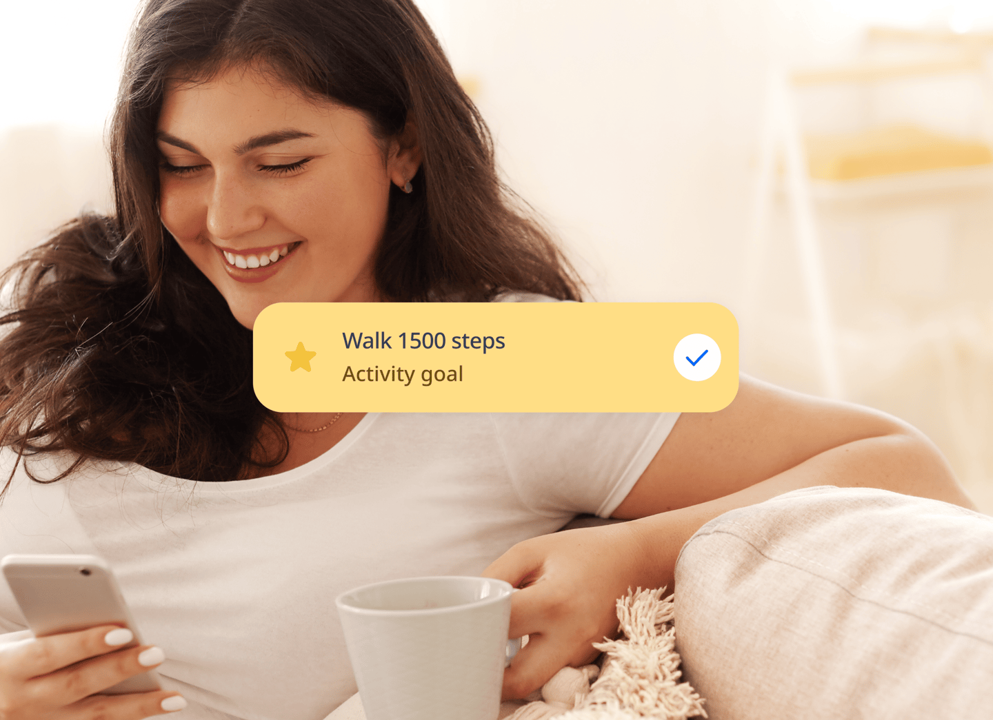
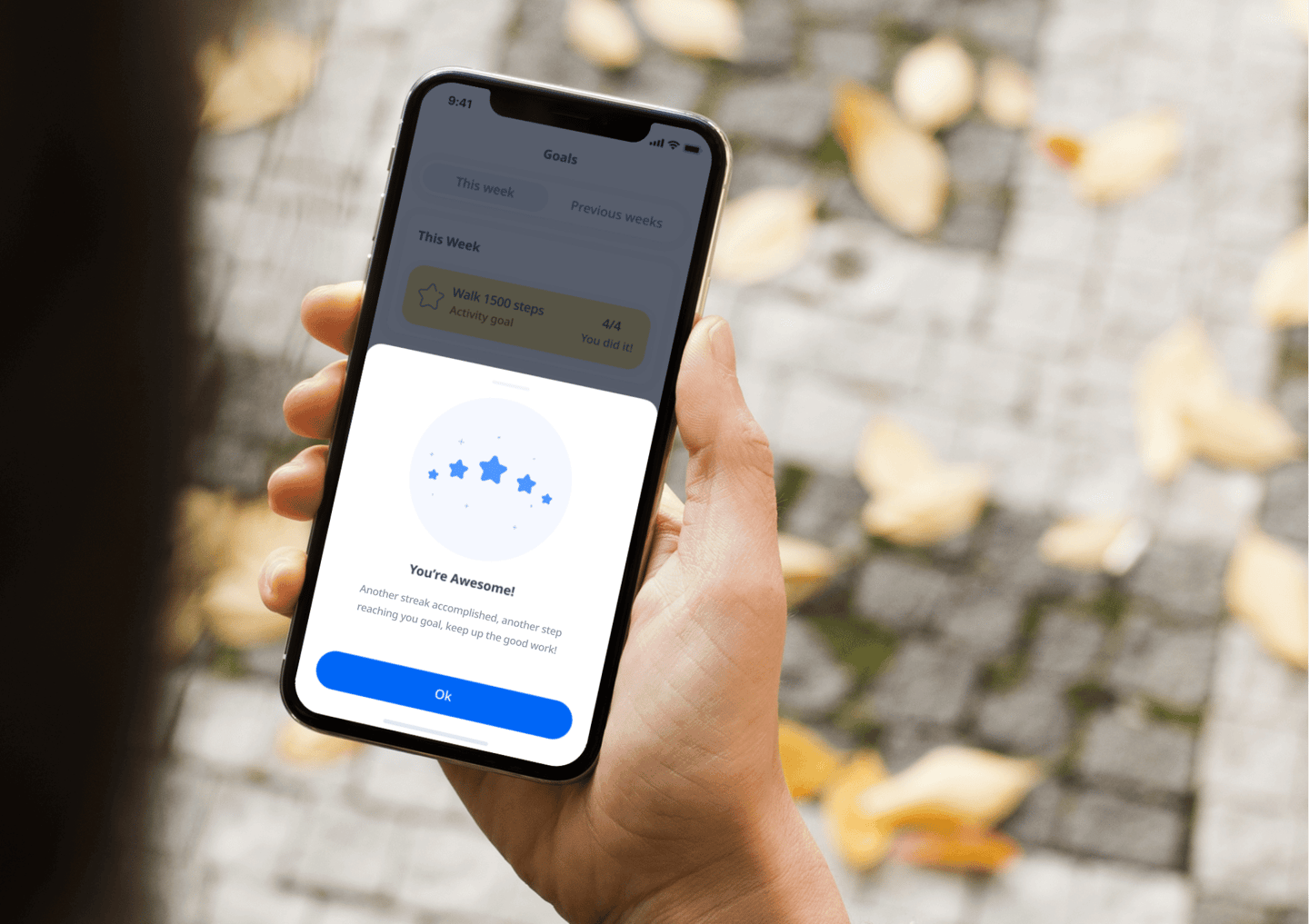
Goals can be added as physical, diary and mind goals. Users can click to show completion where this is presented in their previous accomplishments. Users can also see readings they have started and read.

Readings

Weekly readings are promoted to the user based on their medical journey and how far along they are. This is to help inform them and give them tips and tricks to boost moral and provide a sense of community and more importantly reduce the sense of isolation.

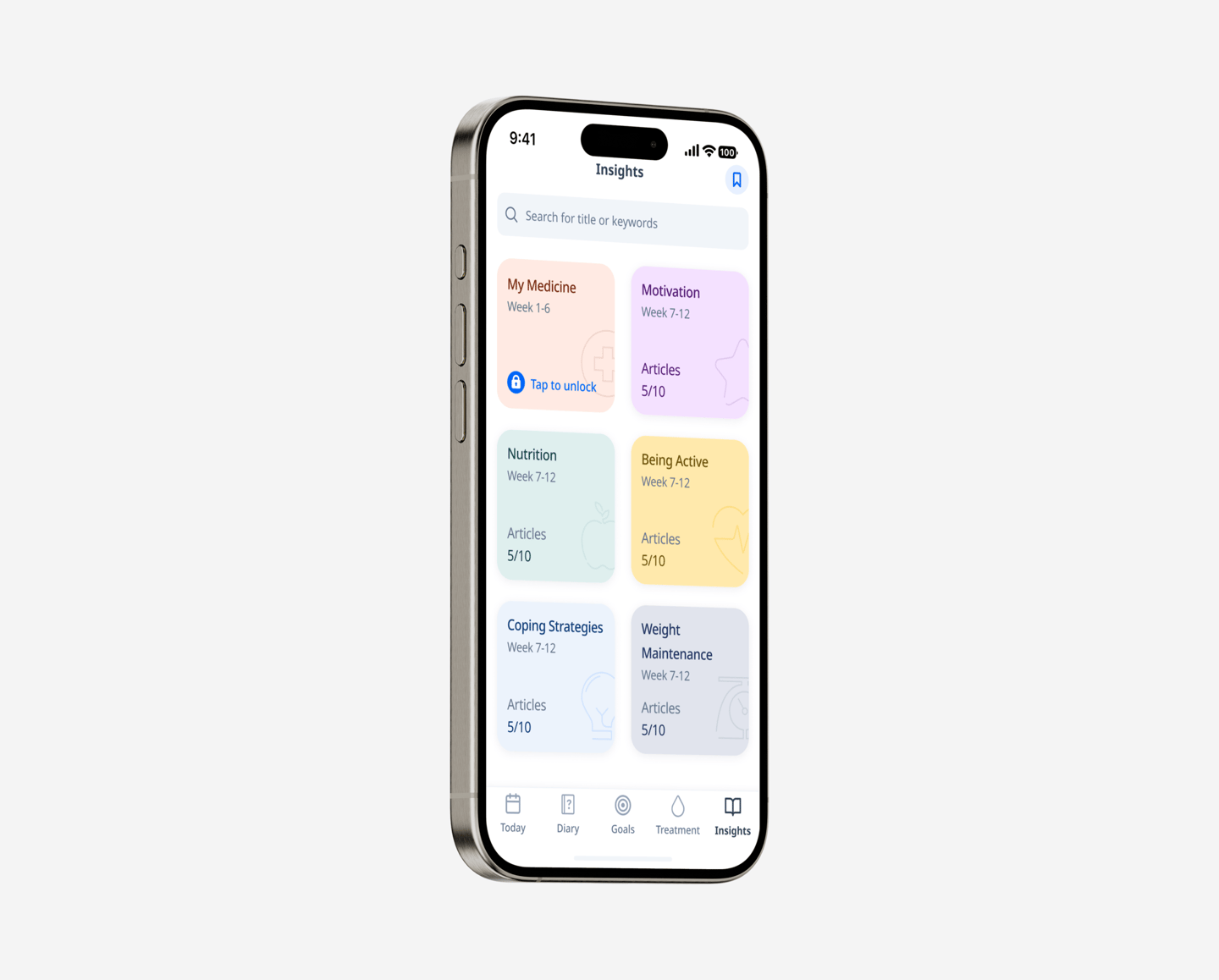
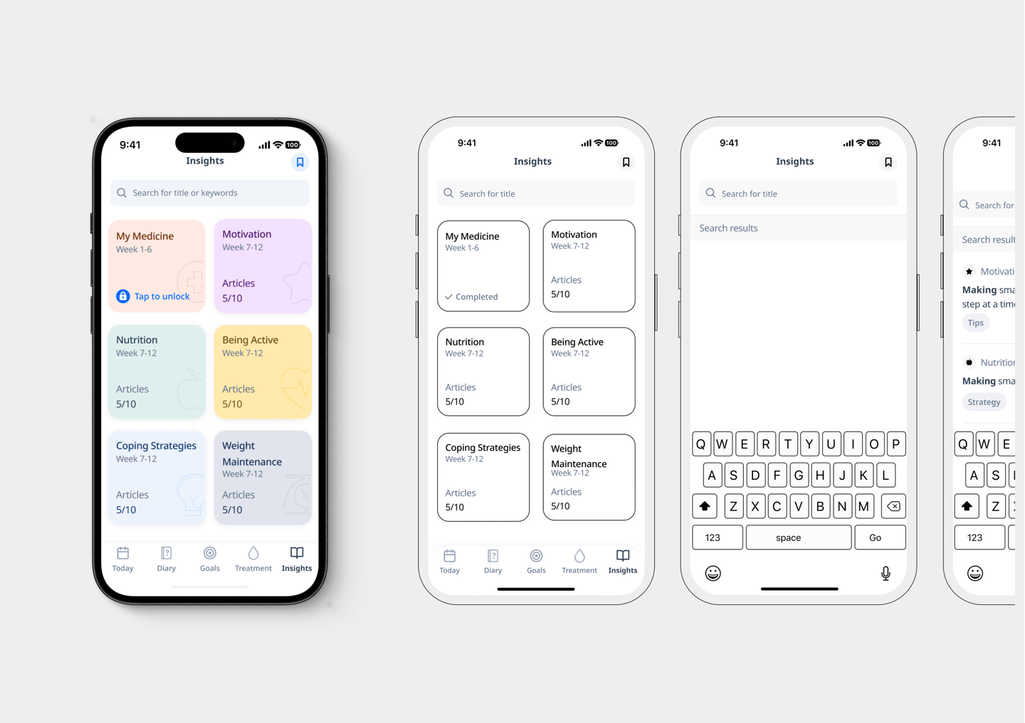
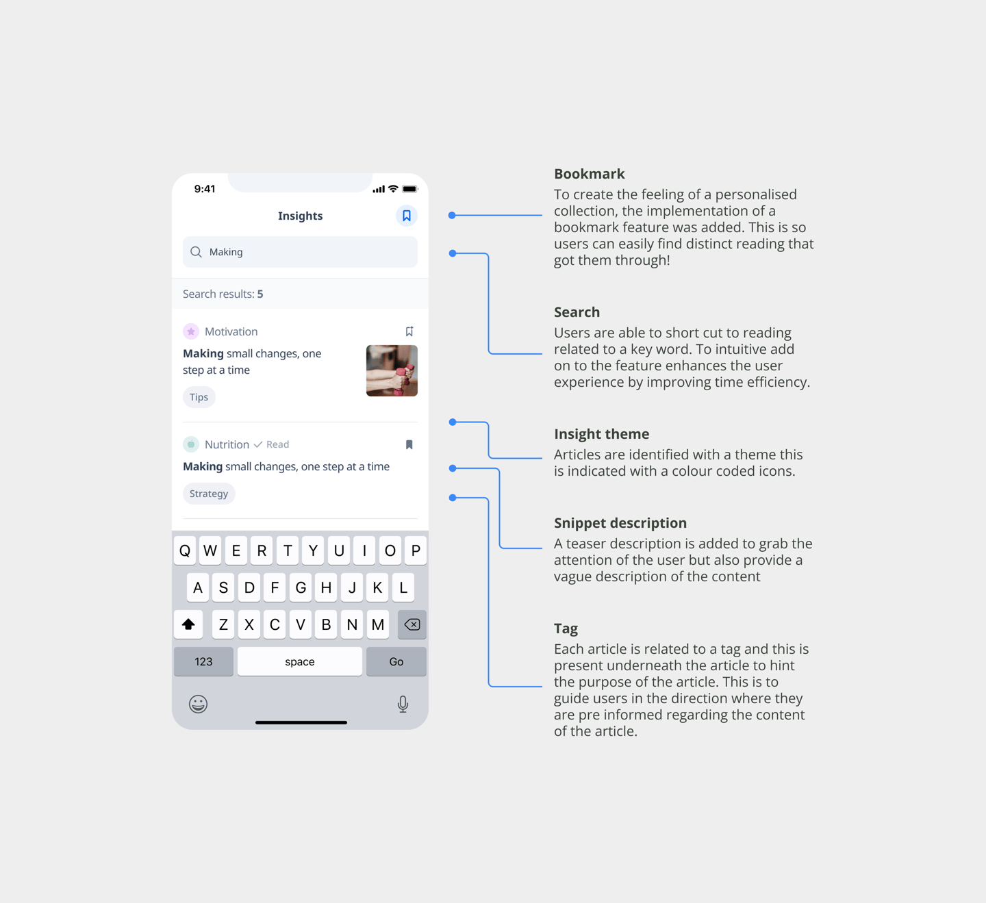
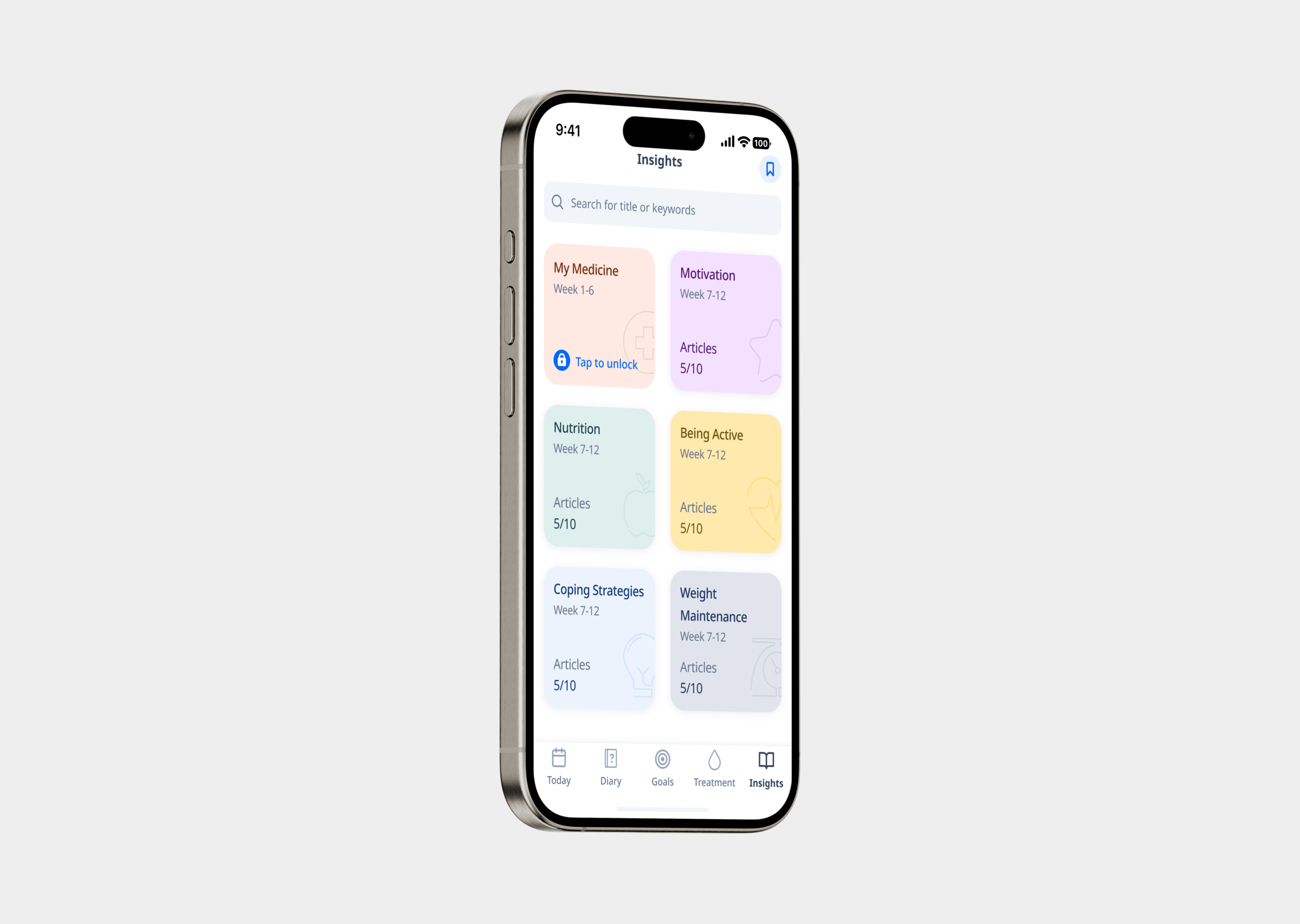
Introducing an insights feature was designed to help install a sense of guidance.

Bookmark

To create the feeling of a personalised collection, the implementation of a bookmark feature was added. This is so users can easily find distinct reading that got them through!

Search

Users are able to short cut to reading related to a key word. To intuitive add on to the feature enhances the user experience by improving time efficiency.

Insight theme

Articles are identified with a theme this is indicated with a colour coded icons.

Snippet description

A teaser description is added to grab the attention of the user but also provide a vague description of the content

Tag

Each article is related to a tag and this is present underneath the article to hint the purpose of the article. This is to guide users in the direction where they are pre informed regarding the content of the article.